


Servicios Personalizados
Revista

Articulo
 Inglés (pdf)
 Articulo en XML
 Referencias del artículo
Links relacionados
Compartir

 Permalink
CLEI Electronic Journal
versión On-line ISSN 0717-5000
CLEIej vol.16 no.3 Montevideo dic. 2013
A Strategy for Selecting Points of Interest on Mobile Devices for Emergency Situations
Manuel J. Ibarra
Escuela Académico Profesional de Ing. Informática y Sistemas
Universidad Nacional Micaela Bastidas de Apurímac
Apurímac, Peru
and
Álvaro Monares, Sergio F. Ochoa, José A. Pino
Computer Science Department
Universidad de Chile
Santiago, Chile
{amonares, sochoa, jpino}@dcc.uchile.cl
Abstract
The need to use mobile technology in urban emergency response processes has recently been identified, given the importance of having relevant information to make decisions in these scenarios. The data visualization on small mobile devices, such as PDAs or smartphones, is a critical aspect to make appropriate and on-time decisions. This criticality particularly occurs due to the small size of their screens to show geographical data. This article presents a strategy to select and display the most relevant Points of Interest on a digital map, according to the emergency influence area. This strategy was implemented on the MobileMap tool, and then it was evaluated through simulated emergency situations. Commanders of various Chilean Fire Companies participated in this evaluation.
Spanish abstract
La necesidad de utilizar tecnología móvil en el proceso de respuesta a emergencias urbanas se ha puesto recientemente de manifiesto, debido a la importancia que tiene contar con información de apoyo para la toma de decisiones en dichos escenarios. La presentación de datos en dispositivos móviles pequeños, como PDAs o teléfonos inteligentes, es un aspecto crítico para tomar decisiones apropiadas y a tiempo. Esta criticidad está dada particularmente por el reducido tamaño de la pantalla y el tipo de información a desplegar que usualmente es geográfica. Este artículo presenta una estrategia para seleccionar y visualizar los Puntos de Interés más relevantes sobre un mapa digital, de acuerdo al área de influencia de una emergencia y al nivel de zoom utilizado. Esta estrategia fue implementada en la herramienta MobileMap, luego evaluada a través de situaciones de emergencia simuladas. En esta evaluación participaron comandantes de distintas compañías de Bomberos de Chile.
Keywords: Data visualization, Mobile devices, Small-size screen, Geographic information system, Human-computer interaction, Context information, Urban emergencies.
Spanish keywords: visualización de datos, dispositivos móviles, pantalla reducida, sistema de información geográfica, interacción humano-computador, información de contexto, emergencias urbanas.
Received: 2013-03-01, Revised: 2013-11-05 Accepted: 2013-11-05
1. Introduction
In recent years we have seen a revolution in miniaturization and price of mobile and wireless communication devices [ 1], [ 2]. Mobile devices have significantly captured peoples interest, getting inserted into daily work. This has generated many possibilities to develop software to support various activities. Some of the application scenarios are: education, tourism, health services and daily emergencies.
Mobile devices have some usage limitations, such as small screen size, little memory capacity, exiguous persistent storage and few data input mechanisms [ 3], [ 4]. As a consequence, it is necessary to make a detailed analysis when designing software for these devices, in order to prioritize the information to be displayed on the screen and ensure applications usability.
A mobile device screen can be adapted to show information such as weather condition or vehicle traffic. As humans, we are used to find some information in specific locations. Thus, static and dynamic information should be easy to find.
Many researchers have studied the limitations of the small screen devices to appropriately display information [ 4], [ 5], [ 6]. The existing proposals focus on relevant information and they provide an overview of the context information [ 7], [ 8], [ 9].
This challenge is also relevant for mobile applications which support emergencies, especially in urban areas. Some examples of these events are: fires, car accidents, gas leakages, infrastructure collapses, and chemical/water spills.
Some researchers have identified the use of mobile devices during emergency situations as very important. These devices can provide relevant data from the disaster affected area [ 10], [ 11]. Most required information in an emergency is related to geography, such as: the emergency location, the affected infrastructure, the influence area of the event, the location of the available resources needed to deal with the response process. The geospatial information of the affected area is very important to analyze their vulnerability and manage risks associated with it. Such information is also necessary to perform the event response and recovery activities [ 12], [ 13], [ 14].
This paper presents a strategy to display geographic information on smartphones, avoiding information overload. This strategy was implemented as a new version of MobileMap [ 13] that was developed and delivered to help overcome these limitations. We decided to implement a mobile solution on a portable device, since these gadgets are increasingly becoming ubiquitous, and therefore a firefighter could install this solution on his/her own device.
This paper is organized as follows. Section 2 presents the related work. Then, section 3 presents an analysis of audio recordings from past urban emergencies. That section also presents the methodology used to characterize frequency of sent/received messages in the context of an urban emergency. Section 4 describes the proposed strategy to select and display information which is relevant to an emergency context. Section 5 explains the evaluation methodology used to validate the strategy. Finally, section 6 presents the conclusions and future work.
2. Related Work
Burigat and Chittaro [ 15] reported a research related to the effectiveness of visualization on mobile devices based on macro and micro views. The study addresses unexplored aspects of the design of mobile user interfaces. In particular, they investigate the effect of allowing users to manipulate information over maps and highlight the potential Points of Interest (POI) of an area. Some examples of POI are: police stations, water hydrants, hospitals, schools, fire stations, nursing homes, and any other physical point that is important for emergencies situations. The experimental results suggest that both the manipulation of graphical interfaces and the highlighting of important points in the global view, have positive effects on users time performance. This allows completing fast search tasks on mobile devices but it does not provide specific advantages in terms of recovery of spatial configuration of POI objectives.
Moreover, Bederson [ 16] conducted a study of the essential problems of Zoomable User Interfaces (ZUI), which highlights there is more useful information than the one that can be shown on the small screen of mobile devices. The most common solutions to this problem of lack of space in the interface are to use scrolls or links to other windows, or use search and zoom options. These researchers conclude that using zoom options creates significant advantages for spatial perception and memory retention of human beings, and improving navigability on two-dimensional images. The study indicates that the ZUI works well whenever there are a few items to show on screen. However the problem persists when many items need to be displayed on the screen.
Similarly Chittaro [ 4] conducted a research on a new approach to display Points of Interest (POIs) on the screen of a mobile device. This study proposes and analyzes the results of the "Halo Technic", which tries to show the information of POIs that are off the screen, using a bulb that has an aura associated with it (like shock waves). In that way, the POIs located off the screen, can be predicted visually: its distance and location. The problem with this approach is that if you have several categories of POIs, then you would have to use multiple distinguishable line colors between them, which could overwhelm curved lines on the screen of the mobile device.
Monares et al. [ 13] proposed a solution called MobileMap that allows exchanging digital information between the Incident Commander (IC) on the field and the Alarms Center (AC). The IC is in charge of the response process in the field, and the AC acts as support for it. The communication between these two nodes is by WiFi and GSM networks, using smartphones and laptops. The results show that the tool helps to reduce the arrival time of the firefighters to the emergency scene. MobileMap shows a map with two arrows, one indicating the location of the emergency, the other one, displaying the vehicle direction. However, the approach has some shortcomings such as the displayed information is not characterized and that the mobile device screen becomes saturated.
The reviewed related work shows there are indeed serious problems to display information on the screen of mobile devices. This paper extends Monares proposal and presents a strategy to display emergencies POIs, combining Zoom and the selection of POIs within a radius of action and showing objects dynamically and differentiated by colors. Next section presents a study of past emergencies, where we gathered and classified the relevant sent/received information during an emergency occurrence.
3. Identifying Relevant Information for an Emergency
The goal of this part of the research was to try to identify the type of relevant information that should be shown on the MobileMap screen. We also tried to understand the changing behavior of this information. For this purpose, we analyzed audio recordings of past emergencies, in which the firefighters of Ñuñoa, Santiago, Chile participated. This Department is organized in eleven Companies that serve five districts: Ñuñoa, La Reina, Peñalolén, Macul and La Florida (approximately 3 million inhabitants).
The Ñuñoa AC provided the audio recordings for all radio communications of the urban emergencies occurred during one year (2009). Each recording has the interchanged messages during the response process of an emergency (from beginning to end of an emergency). This information is recorded in *.mp3 audio files. For this work, we just considered small-sized and medium-sized urban emergencies, i.e. emergencies having firemen working less than eight hours on-site. Larger emergencies require further collaboration, including larger communication and coordination efforts than the type of emergency responses we would like to support. Table 1 shows the emergencies that occurred in the past five years, which were managed by the Ñuñoa AC.
Table 1: Ñuñoas AC urban emergencies
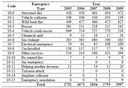
Some types of emergencies are more frequent than others, e.g., in our data, structural fires, vehicular crash rescues and wild bush fires account for 54.35% of all emergencies in 2009. In our analysis, the audio recordings selected for our study kept the representativeness of emergency types shown in Table 1. Moreover we also got information from interviews to ICs for complementing the information recorded in the audios, e.g. in case when the radio system was unable to record the voice messages, or when the messages were not understandable enough because of signal interferences. Such activity was done during four focus group sessions.
The methodology for the communication study during emergencies is now explained. First, we selected 130 emergencies (from the 2,997 occurrences in 2009) by stratified random sampling, keeping the representativeness of emergency types occurred during those 5 years. The audio recordings of radio messages from these 130 emergencies (covering all types of emergencies) were chosen for analysis.
The selected emergencies were listened (from the recorded audios), analyzed, and every message exchange between the AC and the IC was classified. Firefighters use codes to convey information more efficiently, e.g. they use code 1-2 for Request for an ambulance at the emergency site, 0-5 for Report your location, 6-3 for Equipment at site, etc. In total, firefighters and the AC use approximately 120 different codes of this type. Naturally, most of the relevant recurring messages correspond to these codes. The coded messages in our study were 2,484. The messages that were most frequently repeated are presented in Table 2. This table provides a ranking of the most important messages exchanged by the AC and ICs in the 130 studied emergencies.
Table 2: Most frequent messages 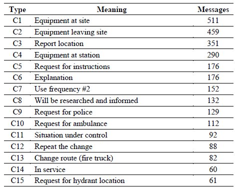
However, it is natural to consider that to some extent, the exchanged messages depend on the type of emergency (e.g., the data shows that the report location messages (code C3) are eight times more frequent in wild bush fires than in emergencies with hazardous materials). Thus, it is important to support both the most frequent and the least frequent messages when proposing a solution for ICs and the AC.
Exchanged messages may also be classified according to their intent. For example, in Table 2 messages C1, C2, C4, C11 and C14 are informative messages with the purpose of notifying all participants of the status of the equipment (e.g. fire trucks), while C3, C5, C9, C10 and C15 are messages with requests, and C6, C8, C12 and C13 are administrative messages. The types of messages that could be classified into these three categories were more than 89%. From all classified messages, 46% were informative, 27% were requests for information, 16% were administrative messages, and 11% were of other types. These statistics allow us to understand the type of information exchanged between the AC and the IC, and the timing of such exchange. In order to support the participants information needs and thus try to reduce the radio channels usage, we have extended the MobileMap application.
4. Selection Strategy and Relevant Information Display
MobileMap can be seen as a Geographic Information System, where Points of Interest (POI) are deployed on demand. A POI is a milestone displayable on the map, which has attributes such as: name, icon, latitude, longitude, and a detail.
Figure 1 shows an example of the structure of a POI named "buildings", which is stored in a "buildings.xml" file and displayed on the user interface on demand. The <Type> </Type> tag represents the POI type, for example: water hydrant, hospital, police station, fire company, important buildings, for this specific case the POI stands for "buildings". The tag <Icon> </Icon> represents the name of the icon to display on the map. Generally a file is 30x30 pixels, it has an average size of 1 KB and has a "*.png" file extension. The <Zoom> </Zoom> tag determines the zoom level at which the representative icon is displayed on the map. The <VisibleOnlyInRadio> </VisibleOnlyInRadio> tag has two possible states: "Yes" or "No"; "Yes" indicates that the POI will be displayed only within the range, otherwise it will be shown in and out of range. The <Name> </Name> tag indicates the name associated with the POI. The <Address> </Address> tag indicates the address (street, avenue) in which the POI is located. The <Coordinates> </Coordinates> tag indicates the POI coordinates (Latitude and Longitude).
In the next steps we will describe the main features of MobileMap, its usefulness, then the selection strategy and the implemented POI.
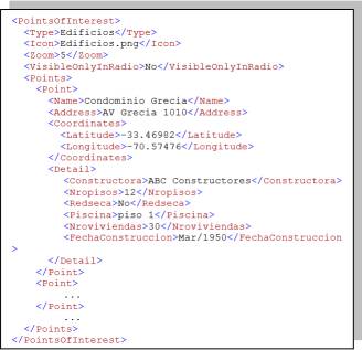
Figure 1: Structure of file buildings.XML
4.1. Zoom Levels
In emergency situations, sometimes there is no Internet connection. MobileMap has maps stored in the device. The full maps are composed of small pieces (tiles). The application has 7 levels of zoom. After an usability study we found that from level 6 up it is acceptable to show the POIs on the map. Under the zoom level 6, it is unnecessary to show them because it saturates the screen with icons (Figure 2). To meet this need, the tag has <Zoom> 6 </Zoom> in which the user specifies the zoom level at which the icon will display the POI.
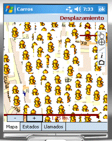
Figure 2: Water hydrants saturate Smartphone screen
To solve the problem of screen saturation, we decided to show POIs in a range, and from a certain level of zoom. Both are configurable; these variables are represented as system parameters and specified in the config.xml file. The range is set using the <RadioAccionPDI> tag. For example <RadioAccionPDI> 200 </RadioAccionPDI> indicates that the application will display POIs that are within a radius of 200 meters, with the center point located at the emergency position. An algorithm was designed (presented later in this article) to select and display POIs in that range. The POIs are selected considering that an emergency can occur at the intersection of two or more districts (municipalities). There is a function that calculates the distance between two points; it has two parameters, each one in coordinates "Latitude and Longitude".
4.2. POIs Out of Range
Showing POIs within a range is very applicable for water hydrants, because there are many hydrants installed in the streets. However, there are other POIs to be shown, either within or outside the range, and whose density is not high, such as Fire Companies or Hospitals. For these cases there is a tag named <VisibleOnlyInRadio> No </VisibleOnlyInRadio>; it indicates the POI can be displayed inside and outside the range without any restriction. These new capabilities of information visualization have enabled fast reading of MobileMap and provide a better view of the information displayed on the map.
Figure 3 shows the icon "![]() " which represents the scene of the emergency, and clicking on the icon you can see the type of emergency. The figure also shows the water hydrants "
" which represents the scene of the emergency, and clicking on the icon you can see the type of emergency. The figure also shows the water hydrants "![]() " within a range (e.g. 200 meters). This information allows firefighters quick access to these resources to respond to a fire. Using the ruler "
" within a range (e.g. 200 meters). This information allows firefighters quick access to these resources to respond to a fire. Using the ruler "![]() ", which is in the toolbar, we can measure the distance between two points. For example, between an emergency location and a water hydrant, or between an emergency location and a school.
", which is in the toolbar, we can measure the distance between two points. For example, between an emergency location and a water hydrant, or between an emergency location and a school.
Figure 3 (emergency scenario) shows a building very close to the emergency location; it is represented with the "![]() " icon. If it is populated, those people might be in needed of evacuation. Figure 3 also shows an Area of Interest (AOI) near the emergency (chemical factory), which is labeled "Inflammable". This means the building is close to a dangerous fire, so the fire spread could cause further damage to the infrastructure that is located around it.
" icon. If it is populated, those people might be in needed of evacuation. Figure 3 also shows an Area of Interest (AOI) near the emergency (chemical factory), which is labeled "Inflammable". This means the building is close to a dangerous fire, so the fire spread could cause further damage to the infrastructure that is located around it.
Figure 3 also shows fire trucks that have arrived at the emergency site, e.g. trucks BX-4, S-2 and Q-2. The location of the truck is indicated on the map showing an identifier code for each one. The blue ones (marked with "A") represent trucks that are on site of an emergency assignment, or very close to it. The other ones, trucks B-4 and B-5, are represented by green color and assigned the "V" label, indicating that they are coming to the place of assigned emergency (between 800 and 2000 meters of it).
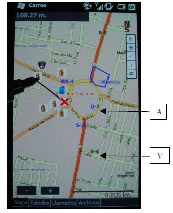
Figure 3: Displaying information after applying the proposed algorithm
4.3. Areas of Interest
The tool also displays AOIs. Typically these areas represent resources that can be used for the response process (e.g. a water canal or pool where firemen can get extra water to fight a fire) or risk points such as a school, a nursing home or a factory using inflammable material. These AOIs are stored in ".xml" files. The basic structure used to represent the information of an area of interest is similar to that used to represent a POI. Additionally AOI specifications use a tag named <Centroide> representing the coordinates of the figure center (Figure 4), and the <Vertices> tag represents the vertices of the polygon shown on the map for displaying an AOI.
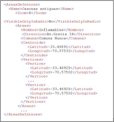
Figure 4: XML file format representing an AOI
4.4. Sending and Receiving Files
The application lets a person send files to the server in the AC. For example a firefighter can take a picture of an important event during an emergency and send that picture to the AC. To perform this task, the application serializes the bytes of the captured image and then invokes a Web Service that runs on the AC server. The service stores the picture in a shared folder (the folder name is configurable in the "config.xml" file) that the system maintains for each emergency. In that way, the picture is available for firefighters assigned to that emergency. The stored filename of the picture is associated with the name of the emergency and concatenated with hour, minute and second of the event when the picture was taken, for example "2046_173010.jpg".
The MobileMap application can also receive files. This feature lets the IC access to context information and makes him/her able to quickly make decisions. Examples of this type of context information are the electrical blueprints and house gas blueprints (Figure 5).
This functionality is also used when the IC wants to inform drivers of other fire trucks about the best route to take, if the typical path is currently closed or congested. In this case the AC can send a map with the route to be chosen to quickly reach the emergency site (Figure 6).
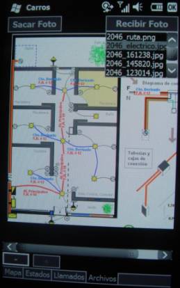
Figure 5: Smartphone displaying an electrical blueprint
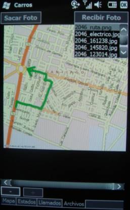
Figure 6: Alternative route to be followed by a fire truck
4.5. Representation of Colors
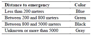
The application allows you to display the current status of each truck (availability and location), which helps ICs to have an early warning of the trucks they will have available. Table 3 shows the colors code used in the application, based on the truck proximity to the emergency site. This kind of representation allows the IC to identify the distance to their resources, rather than reading each number.
Table 3: Colors and their meaning
4.6. Dynamic Reading of POI
The <Detail></Detail> tag can have a variable number of child nodes, e.g. the user can add or remove any features of POIs, as he needs the information. If a POI has no special feature, then the tag could be empty.
In order to get POIs information, first the .xml file is located. Once the application locates the file, then it selects the information within it by using XPath. Xpath is an XML Path Language, used to make queries on an XML file. XPath also allows selecting and referencing text, elements, attributes, and any other information contained in an XML file.
Consequently, for a dynamic reading of the detail of a POI, first the XML file containing this information is loaded, then using XPath the POIs are selected and the result is assigned to an XmlNodeList and so manage the information about the POI. Then, each POI is read to obtain information like: name, address, latitude, longitude and other details. If the detail contains child nodes, we traverse each of these nodes using an enumerator. This way of dynamically traversing an XML file is very important to deploy detailed information of POIs on MobileMap. Figure 7 shows a fragment of code that reads an XML file that contains the POIs associated with a POI category, for example the "buildings" category.
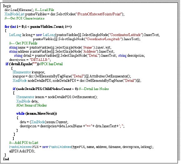
Figure 7: Dynamic reading of POI
4.7. Algorithm to Display Information on Mobile Device
This section presents the algorithm to select the information to display on the screen of the device. The algorithm considers the zoom level at which information must be deployed and the POI range within which the POIs are relevant (Figure 8).
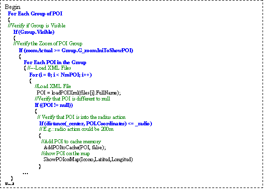
Figure 8: Algorithm to properly display information
4.8. Logical Architecture
The application makes a connection to the AC server using Internet via 3G or WiFi networks. This method lets the IC and AC exchange current information about an emergency or data on the affected site, such as: the characteristics of this emergency, the state and location of the fire trucks and some current pictures of the emergency place. Figure 9 shows the logical architecture.
The ACs database server stores the operational data related to each emergency: its exact location, assigned fire trucks, dispatch time, arrival time, IC name, etc. The Simple Object Access Protocol (SOAP) server provides the "Web services" that will be consumed by the mobile application running on the IC device (e.g. a laptop, tablet PC or smartphone). The server application also stores images (photos, sketches, etc.) that will be eventually required by mobile clients (e.g. the IC or another firefighter).
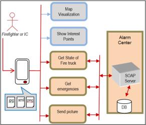
Figure 9: Logical architecture
4.9. Service-Oriented Architecture
A service-oriented architecture (SOA) is a style of software architecture for designing and developing software in the form of interoperable services. These services have well-defined business functionalities that are built as software components (discrete pieces of code and/or data structures) which can be reused for various purposes. SOA design principles are used during the phases of systems development and integration.
Nowadays two types of webservices are mainly used: Representational State Transfer (REST) and SOAP. The REST implementation differs from its SOAP counterpart in very fundamental ways. While SOAP adheres very closely to the RPC model, REST revolves around the concept of resources and focuses on using the inherent power of HTTP to retrieve representations of these resources in varying states. In the REST style, every resource is accessed by a unique URL which may be operated on by a subset of the core set of HTTP commands: GET, POST, PUT, and DELETE.We investigated both SOAP and REST, in order to gauge their potential effectiveness in AC server underlying back-end data transmission requirements. In the next section we present the obtained results.
4.10. Server Stress Testing
Performance testing is generally executed to determine how a system or sub-system performs in terms of responsiveness and stability under a particular workload. It can also serve to investigate, measure, validate or verify other quality attributes of the system, such as scalability, reliability and resource usage.
Table 4 shows the comparison of software testing. We used the SOAP and REST approaches. The Number of Readings column presents the number of requests (or queries) from the client to server. The SOAP Time (s) column lists the time delay in seconds to respond the requests using the SOAP approach. The REST Time (s) column presents the time delay in seconds to respond the petitions using the REST approach.
When the number of requests is under or equal 50, the time delay is similar for both SOAP and REST. When the number of petitions is larger than 50, the REST approach seems to be faster.
Table 4: SOAP and REST testing 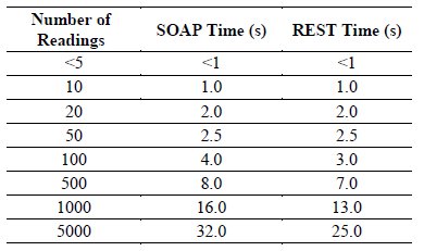
Table 5 shows detailed information of eleven emergencies. The Type column lists the type of emergency, the Duration column contains the number of hours from the beginning of the emergency until it is controlled, and the Number of Trucks column presents the number of trucks that arrive to control the emergency.
Table 5: Number of trucks and emergency type 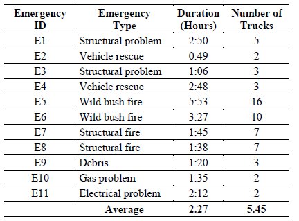
In this situation, the average number of trucks arriving to an emergency is 5.4. Considering the top one (E5) used 16 trucks, and taking into account that each truck has typically three firefighters, then the maximum number of simultaneous petitions could be 48. Thus, the choice of either SOAP or REST seems to be irrelevant for this case.
5. Evaluation of the Proposed Strategy
We performed two types of evaluations to validate this proposal. The first one was a focus group and the second one a review by expert users [ 17], [ 18].
5.1. Focus Group Evaluation
During the course of this work, we organized a focus group. We invited commanders of the Chilean National Board of Firefighters. The event took place on September 8, 2011 at the Department of Computer Science, University of Chile. They were five commanders from the Ñuñoa and Downtown Santiago Firefighter Departments. All commanders had many years of experience in urban emergency response rescue. One of them was also the national leader in urban rescue training, who also supports other fire departments in the region (mainly from Argentina and Peru) in training tasks, planning, coordination and management of such events.
The evaluation process was as follows. First, the new version of the tool was presented to them. Then, a simulation of an emergency (two story house) in an area known for these commanders was initiated. The simulation was externally done with the support of a notebook. This computer simulated the full registration process of an emergency, which is regularly performed by operators of the Fire Alarms Center.
The process continued when the commanders used smartphones to identify the available resources for the fire response process, and the location of these resources. The movement of fire trucks assigned to the event was simulated by the notebook representing the AC. This computer periodically reported to the smartphones the new location of mobile resources, whenever they had changed.
During the period in which the emergency was active, the commanders made decisions based on the available information on mobile devices. Then they compared the response process, with one in a real emergency scenario. Finally, they filled out a survey to evaluate the usability and usefulness of the tool.
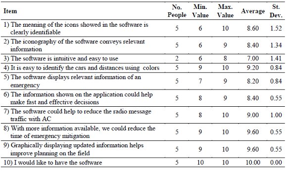
Table 6 shows the results of the survey answered by the focus group participants. The participants answered using a 0-10 scale, where 0 represents "strongly disagree" and 10 represents "strongly agree". The second column indicates the number of people who evaluated a certain item. The table also shows the minimum and maximum value assigned to that item by participants. The "Average" column indicates the average score given to each item. Finally, the last column of Table 6 shows the standard deviation of the obtained values.
Table 6: Opinion of the focus group participants
Now we discuss the obtained results:
Regarding the management of graphical information. Items 1) and 2) obtained an average of 8.60 and 8.40 respectively. This shows that commanders agree on positively qualifying the graphic symbols used in the application, particularly those used by the software to represent available resources for the response process.
Regarding the availability of information. Items 4) and 5) obtained an average of 9.20 and 8.20 respectively. Commanders positively rated the fact the application allowed them to have easy availability of relevant information, according to the context of the emergency. It also allows them to quickly identify relevant objects to respond to the emergency. The results also indicate that the system helps to see the position changes of resources, almost in real time (e.g. the movement of fire trucks).
Regarding decision making. Items 6) and 9) obtained an average of 8.40 and 9.60 respectively. This shows the participants agreed to positively consider the fact the information shown on the application would allow them to have a good tool to make their work fast and effective. Also, they acknowledged having information to help support the planning work during an emergency.
Regarding the reduction in radio traffic. Items 7) and 8) obtained an average of 9.00 and 9.60 respectively. This shows the participants believed that tool usage could help reduce radio traffic and also the total time of the emergency mitigation.
Regarding the use of software. Items 3) and 10) received an average of 7.00 and 10.00 respectively. Item 3) shows that three participants did not answered it. This was probably due to the fact they had not yet made full use of the tool, and therefore they declined to comment. Item 10) shows that the commanders agree that they want to have the tool available at their Fire Companies. This suggests the commanders see the tool as easy to learn for their firemen.
5.2. Expert Users Review
The usability of the application was evaluated by the opinion of expert users. In particular, we wanted to evaluate the design of the interface and the value of the strategy for selection and displaying of POIs. To perform this task, we asked three usability experts, who were teaching assistants in the Software Interfaces Usability Workshop, which is regularly taught at the Department of Computer Science, University of Chile. These people work and research in software usability issues, including interfaces design for mobile devices.
The validation process began with a brief explanation of the purpose for which the tool was designed, and the end user for which it was designed. Then the simulation was carried out for an emergency; it began with the selection of the emergency site and emergency dispatching of fire trucks (similar to that performed in the previous item). Then the "expert users" used the tool by 20 minutes.
Then, they completed a survey in which they gave their opinion about the design and usability of the application. This yielded some minor observations and comments by the experts, who considered adjusting the current system interface.
Table 7 shows the results of the heuristic survey applied to expert users. The participants completed the survey on a 0-5 scale, where 0 represents "strongly disagree" and 5 representing "strongly agree."
The first column of the table shows number of participants. The "minimum" and "maximum" are the assigned values to that item by the participants. The "Average" column indicates the average score obtained by each item. Finally, the last column of Table 7 shows the standard deviation of the obtained values .
Table 7: User Expert Opinion
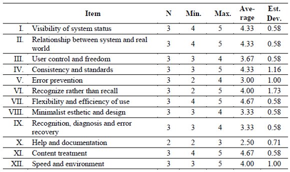
Flexibility and efficiency of use obtained an average score of 4.67, which means that access to the menu options is easy and intuitive. The content treatment (item XI) obtained the same average value, which means the content is appropriate to the social and cultural reality of the user.
Furthermore, three items obtained an average of 4.33. The first of these items is visibility of system status; the obtained score means the application shows clearly to the user the location in the system, and the links are clearly marked. The second item refers to the relationship between the system and the real world, e.g., the application has a clear language, the used concepts are understandable and meaningful words are correct. Finally the consistency and standards item shows there is consistency between the name of the menu and the pointed site, all menu options have content, there is coherence between a page title and content, and there is only one button to take the user to the same content.
Help and documentation obtained a 2.5 points average, one of the lowest. Evaluators rated this item with this score, because MobileMap does not display help information built into the tool; there only are some preventive messages in case of an error.
6. Conclusions and Future Work
Developing applications for small mobile devices (e.g. PDAs and smartphones) is a challenging task, because the designer has to consider the size of the screen and the hardware limitations. Display information through the user interface is a very important aspect, which can make mobile applications intuitive and productive.
This paper presents a strategy to display textual and graphical information dynamically in mobile devices. The displaying is performed according to the zoom level, and based on the selective presentation of information. The strategy was implemented in the MobileMap tool that supports decision making for everyday urban emergencies.
The tool uses the "Point of Interest" (POI) concept to show the type and location of the resources that are relevant to the process of emergency response. MobileMap optimizes the selection of POIs in a range using the proposed strategy, and then displays them in a simple manner, to allow quick reading and understanding by users.
The strategy proposes to use the codification of colors, representative icons, and regular updating of information, as an effective way to deliver information to the end user. According to usability experts and focus group results, the tool includes a good strategy to select and represent POIs on the user interface. In addition, the visualization technique presents information on limited hardware devices, such as PDAs and smartphones in a very reasonable way.
Furthermore, Incident Commanders believe that the information shown on the mobile device allows them to solve a number of problems. During the first few minutes of a fire there are many radio communications, and one of the most recurring requests is on the location of cars, water hydrants, nearby buildings, areas of risk, etc. Having this information on their mobile devices with representative icons associated to POIs may allow decision making becoming effective and efficient in an emergency.
As a result of the tests, we found out that for the proposed strategy in emergency situations it seems irrelevant the choice of REST or SOAP for the data transmission component because the number of information requests is relatively small.
In future work it is necessary to improve the information display, adjusting the size of the icons (associated to POI) according to the current zoom level in the application. In addition, we need to focus and take advantage of new smartphones features, such as the compass.
Finally, future research will test the most demanding POIs selection algorithms, and how to display information on small screens in Android and iOS platforms. It also remains to study the adaptation of the tool to other environments, such as tourism, hotels, restaurants and travel routes.
Acknowledgements
This work was partially supported by Fondecyt (Chile) grant: 1120207. Thanks to the Ñuñoa Fire Department for their continuing interest and support to our work.
References
[ 1] J. Donner, Research approaches to mobile use in the developing world: A review of the literature. The Information Society, 24(3), pp. 140-159, 2008.
[ 2] F. Mattern, Wireless future: Ubiquitous computing. Proceedings of Wireless Congress, 2004.
[ 3] S. Burigat and L. Chittaro, Location-aware visualization of VRML models in GPS-based mobile guides. Proceedings of the tenth ACM International Conference on 3D Web technology, 2005, pp. 57-64.
[ 4] L. Chittaro, "Visualizing Information on Mobile Devices". IEEE Computer 39(3), pp. 40-45, 2006.
[ 5] S. Burigat, L. Chittaro and S. Gabrielli, Navigation techniques for small-screen devices: An evaluation on maps and web pages. International Journal of Human-Computer Studies 66(2), pp. 78-97, 2008.
[ 6] H. Zhou, H. Qu, Y. Wu and M.Y. Chan, Volume visualization on mobile devices. Proceedings of the 14th Pacific Conference on Computer Graphics and Applications, 2006, pp. 76-84.
[ 7] B.B. Bederson and J.D. Hollan, Pad++: a zooming graphical interface for exploring alternate interface physics. Proceedings of the 7th annual ACM symposium on User interface software and technology, 1994, pp. 17–26.
[ 8] M. Eissele, D. Weiskopf and T. Ertl, Interactive context-aware visualization for mobile devices. Proceedings of the 10th international Symposium on Smart Graphics, 2009, pp. 167-178.
[ 9] J.L. Encarnacão, M. Frühauf and T. Kirste, Mobile Visualization: Challenges and Solution Concepts. Proceedings of IFIP Conference on Computer Applications in Production and Engineering CAPE95, 1995, pp. 16-18.
[ 10] C.P. Smith, D.M. Simpson, Technology and Communications in an Urban Crisis: The Role of Mobile Communications Systems in Disasters. Journal of Urban Technology 16(1), pp. 133-149, 2009.
[ 11] R. Santos, S.F. Ochoa, Disseminating Shared Information in Disaster Relief Efforts: A Communication Computable Model. Proceedings of the 2011 IEEE International Conference on Systems, Man, and Cybernetics (IEEE SMC 2011), IEEE Press. Anchorage, Alaska, October 2011, pp. 3446-3451.
[ 12] P. Agrawal, I. Rauschert, K. Inochanon, L. Bolelli, S. Fuhrmann, I. Brewer, G. Cai, A. MacEachren, and R. Sharma, Multimodal interface platform for geographical information systems (GeoMIP04) in crisis management. Proceedings of the 6th International Conference on Multimodal Interfaces, 2004, pp. 339-340.
[ 13] A. Monares, S.F. Ochoa, J.A. Pino, V. Herskovic, J. Rodriguez-Covili, A. Neyem, "MobileMap: A collaborative application to support emergency situations in urban areas". Proceedings of the 13th International Conference on Computer Supported Cooperative Work in Design (CSCWD09), 2009, pp. 432-437.
[ 14] I. Rauschert, P. Agrawal, R. Sharma, S. Fuhrmann, I. Brewer, A. MacEachren, Designing a human-centered, multimodal GIS interface to support emergency management. Proceedings of the tenth ACM international symposium on Advances in geographic information systems (GIS02), 2002, pp. 119.
[ 15] S. Burigat, and L. Chittaro, On the effectiveness of Overview+ Detail visualization on mobile devices. Personal and Ubiquitous Computing, pp. 1-15, 2011.
[ 16] B.B. Bederson, The promise of zoomable user interfaces. Behaviour & Information Technology 30(6) pp. 853-866, 2011.
[ 17] J. Nielsen, R. Molich, Heuristic evaluation of user interfaces. Proceedings of the SIGCHI conference on Human factors in computing systems: Empowering people (CHI'90), April 1990, pp. 249-256.
[ 18] J. Nielsen, Usability Engineering. Morgan Kaufmann, San Francisco. ISBN 0-12-518406-9, 1993.

